
Friday, April 14th, 2023
Introduction
Hey folks, welcome back! So last time we got our Circle of Fifths all rendered, and learned enough about how SVG works to make it happen. We've got the basic layout concerns of the component finished, but we've still got a lot of work to do to make this component really shine. Today, we're going to make two simple changes that will help make the component more interactive. Let's get started.
Review From Last Time
Let's take a sec to take a look at the code as it currently stands. I'm going to cut some things out for the sake of brevity - if you're interesting in looking at the whole file, click the link at the bottom of this code sample to see the code at this commit on Github.
Well, so much for brevity.
We should understand all the code here after our sojourn into SVG last time, but just as a quick recap, here's how this component works:
- For each note / key we want to display, we calculate a path that forms a segment, or "wedge" in the circle.
- For each note / key we want to display, we use the same math functions to place a label for that key.
- The wedges and text are rendered in two different groups, which allows us to use a CSS transform on the wedge group to rotate it to look nice.
And really, that's it right now! Despite all the math of path calculation, the component itself is fairly simple. One thing that's jumping out to me is that there's really no need for six separate map calls here - we should be able to generate everything in one loop - but for now, I'm going to leave it alone, since it's easy to work on and understand as it is. I've got a few ideas for cleanup and refactoring floating around, but it's not a big deal at this stage. As a matter of fact, there's currently not even really a reason to caclulate these paths every time we render - we could just as easily hard-code the SVG, since we don't expect it change. But I've got some other ideas that might make it good to leave things dynamic, so we'll leave well enough alone and get on with the main topic.
So anyway, there are two main things I want to do today in service of making the component more interactive. We're going to add a click listener to each of the segments, so that we can use it as a selector for the theory dashboard application (which I swear we're eventually going to cover!). We're also going to add hover styling to the wedges, so the user can tell what they're about to select.
Adding Hover Styling
OK, so hover styling should be pretty easy, right? But it's been tripping me up a bit, because I would like to eventually publish this component on the Node Package Registry. That means I need a good way to make the component customizable, because users might want to change the base color.
In the world of React, there are a couple different methods of styling. Currently, our component is styled via inline styling, which means that we pass our elements a style prop, and those styles are applied to the rendered component. For example, see this snippet, where we style the text that we use to label the minor keys in the Circle.
This works really well in a lot of cases, and fits into the whole React vibe nicely. Especially in cases where we don't want users changing the default styling, this is a great way to encapsulate the display concerns of the component. In cases where we do want the user to be able to customize style, this makes it really easy to consume props passed in from some parent component and use them to change things like colors and fonts.
Unfortunately, though, inline styling doesn't currently support psuedo-classes like... well, like :hover.
I spent quite a bit of time researching this, and the "default" solution to styling hover with props is for the component to implement event listeners for the mouseLeave and mouseEnter events. Those listeners can call a state hook in the component, and toggle a hovered prop (or similar), which we can use to conditionally set the color, like so:
But I mean... gross, right? The way you do it with CSS is like this:
/* default style */
.hoverable-class {
    background-color: red
}

/* style for when this component is hovered */
.hoverable-class:hover {
    background-color: blue
}
Which is a lot simpler, and has the major benefit of not having to execute any Javascript to work. CSS is one of those things that seems scary and arcane if you don't have any experience with it, but as I've gotten more comfortable with it I'm often suprised at how powerful it is to do styling in a declarative way like this.
There are other ways to handle this problem, which mostly fall under the category of "CSS-in-JS" libraries like Styled Components, Emotion, or JSS. All of these libraries are pretty cool, but I would prefer not to force any particular approach on users of this component, and I am also too lazy to learn a new library. So, I take the easy way out, add a classname to the CircleOfFifthsWedge component, and write a tiny little stylesheet, which we can import at the top of our CircleOfFifths component's file.
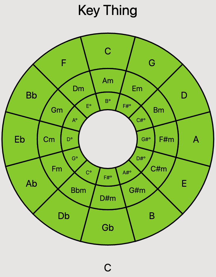
And, just like that, now we see the color of a given segment change when we mouse over the Circle of Fifths. Through the magic of SVG, you can try it out right here!
Now, our users get a much better visual indication of what they're about to click! At this juncture, this is not very customizable by other developers who want to use that component - if you're interested in how I ended up solving that problem, stay tuned, as we're going to cover that in an upcoming post.
(Psst. Want to be notified when new posts come out? Sign up for the mailing list at the bottom of the article!
Adding Click Listeners for Selecting Keys
Alright, now, let's add some click listeners to the segments. This will allow us to react when a user clicks on a segment, and update the display of our Music Theory Dashboard app to reflect the currently selected key.
This is pretty straightforward. First, we'll add a function to our component, which we'll call any time a segment is clicked. To start, this will just log the selection to the console, but eventually, this will allow the Circle of Fifth's parent component to pass down a handler so that it can update based on the selected key.
Next, we'll add a prop to the CircleOfFifthsWedge component, to add an onClick handler to the generated SVG Path element. Since we don't want every segment to be clickable, we'll allow for a null onClick. Later, I realized that I could use Typescript's optional values in a prop type to make this cleaner, but the initial solution works for now:
Lastly, we pass a function to each generated CircleOfFifthsWedge in the rendering loop of our main component. These functions simply call the component's handleClick function with the note name of the wedge that the user clicked, which will let us centralize all of our logic for selection handling in one place.
Alright, let's try it out:
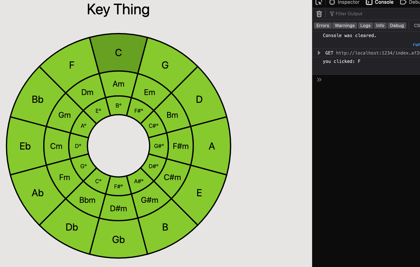
Wat?
Ok... so, when I click "C", the console reports that I have selected "F". I try out a couple more clicks, and realize that I'm always getting the value from the next cell counter-clockwise to the clicked cell (or, the note that's a descending 4th away from my current note).
Turns out that the trick is to rotate the <g> containing the wedges by negative 15 degrees instead of positive 15 degrees. This could probably also be fixed by an adjustment to the loop that generates the paths, but this change solves the problem, so I move on. We could also take the time to understand the mathematical reason that negating the rotation fixes the problem, but I'll leave that as an exercise for the reader. 😉
OK. Now everything is working great, except for one little problem. If I click directly on the label of a given wedge, nothing happens. This is because the <text> elements in the SVG are rendered on top of the wedges. That's an easy fix, we just need to add the pointer-events: none style to our <text> nodes, and they'll pass through clicks to the wedge below:
Exposing Selection to the Parent
Alright! So now our component is interactive, and looking pretty sharp! All that's left to do now, is to let a parent component who renders the Circle Of Fifths pass in a handler for updates to the selection. After all, that's the whole point of all this work we've been doing - to build a truly awesome key picker for our Music Dashboard app.
All we need to do is add a props argument to the component so that parents can pass configuration parameters in. We'll pass down a function called handleKeySelection from the parent. Then, we just call this function in our component's handleClick function (remember, this function is set up to be called with the correct note when any wedge is clicked). If our parent component didn't give us anything to do when the selection changes, we just don't do anything (at least, for now).
Now, back up in our parent component, we set up a state variable using the useState hook. This hook gives us a variable which will refer to the current selection (we name this key). It also gives us a function which we can use to update the value of this variable, and we'll pass that function down to CircleOfFifths via our new prop. For now, we'll just do something simple with this variable, and use it to display the currently selected key - but hopefully it's clear how we'll be able to use this in the future to manage all kinds of neat information panes about the key our user has selected.
Now we're really getting somewhere!
Closing Thoughts
It may not look like much right, but this marks a pretty big point in the life of this component. We've got a fully interactive, nicely rendered Circle of Fifths, which has everything we need to use it as a selector for a key in our Music Theory Dashboard app.
That doesn't mean we're done with this component though. Like I mentioned, as I was working on this, I decided I wanted to take this component out of the "Key Thing" project, and publish it as a React component to the Node Package Registry. In my next post, we'll extract this component into its own repository, and publish it to NPM, so anyone who wants to use this for a cool music app will be able to take advantage of all this hard work!
If you're observant, you might have noticed that this has already happened, by following the links below the code samples in this or the previous post. If you'd like to check out the component, which has been published in an early form, you can go check out the react-circle-of-fifths Github repo, or check out the published package at the Node Package Registry. This component, while in a somewhat early state, is essentially ready to use, so if you find this stuff exciting I encourage you to go build something cool with it! If you run into issues or have any feedback, feel free to file an issue or even submit a PR!
As always, thanks for reading. See you next time!
Want to stay up to date on the latest developments in SVG-based, MIT-licensed Circle of Fifths components for React? Well, you're in the right place! Sign up for my email list via Substack so you can be the first to know whenever I publish a new post, and arm yourself with musical knowledge!